Chart Glitch? (Built in)

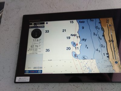
I was running last weekend of the coast of San Diego. I ran this track 2x and it did it in the same place in both direction. A section of the coast has WAY less detail as you can see from the attached picture.

I current have the charts set to auto. What I'm seeing I believe is raster. I tried to go and switch to vector but it was way not an option - it was either greyed out or just din't respond to touch (I was running at speed and it was rough I couldn't really play with it).

Is this a chart glitch?
An area with no chart detail?
Should I have been able to switch to vector or fishing?

I'm open to buying the c-map unlock code if the charts are THAT much better.
 

Attachments

  • IMG_20190623_161951184.jpg
    IMG_20190623_161951184.jpg
    591.3 KB · Views: 2,024
Sounds like old software if you don't see the Vector chart option (HOs). What version of software are you running?
 
Johnny Electron":2aw9rp2g said:
Sounds like old software if you don't see the Vector chart option (HOs). What version of software are you running?
I just installed last week - I tried to update via wifi and it said I'm up to date. I have not done the update that requires an SD card.

I was in the boat on my lunch break today (finally go the radar hooked up) and was able to switch to vector. I panned the map to that location and it did the same thing in vector.
 
I took a picture last night - the chart glitch is in the vector charts too.

I could not find my software version - I looked about in the setting but couldn't find it.
 

Attachments

  • fur.jpg
    fur.jpg
    205.1 KB · Views: 1,987
Charts are in layers and where the official charts come together they are not always surveyed to the same detail. The vector normally looks better because the computer charts allow the unit some flexibility on scaling than the paper (raster) charts. A paid chart (like C-map or Navionics version) sometimes has their own surveys and look better in some areas. I would recommend opening a case with tech support and provide them a Lat/Lon of that area so they can send you some examples of the purchase options for that area.
 
Are you outside the USA where a purchase chart is required? NOAA doesn't provide coverage outside the USA. Areas like Mexico would have to be purchased to view them. Have you zoomed all the way in? Have you contacted Tech support for assistance?
 
This is San Diego. It looks like that area isn't mapped well. This is just north of the harbor and the "glitch" in question is on the Navionics charts too.

I contacted tech support and got some screens shots of both the Navionics (which match the app on my phone) and C-Map.

The Navionics screen shots tell me they are better than the C-Map (or they just didn't send me any shots zoomed in close enough. Though I don't the either are that great that I need to purchase them quite yet.
 

Attachments

  • Navionics Vector (1).png
    Navionics Vector (1).png
    643.9 KB · Views: 1,917
A lot more details populate when ranging in closer. It is a shame support didn't provide you any close in shots.
 
Johnny Electron":11kxj3pu said:
A lot more details populate when ranging in closer. It is a shame support didn't provide you any close in shots.

The did send one slightly closer in shot is San Clemente Island but nothing that matched the Navionics so I could compare the two.
 
I built a PDF document for you to consider. What you are talking about is where NOAA has two surveys that bump next to each other. The ocean side on the area you are talking about really doesn't have much going on and I expect NOAA has better fish to fry. You will see vector charts (where the computer can scale) is better at hiding the surveys than raster. Some people like seeing the raw surveys some don't. Because other mapping companies use the National Hydro-graphic Office data as a base, (unless they do some direct surveys) These survey "stitches" are visible with most of them to some degree. In areas where detailed surveys are needed (like more east, in the channel) NOAA has very good detail as do the other charting companies. Keep in mind that the range/scale of the plotter matters a lot especially with Raster charts. What you are seeing normal. Don't forget there are a ton of chart settings under your menu for customizing and also available high resolution SAT photos that really add to the charts, regardless of which company you choose.
View attachment SanFran Charts.pdf
 
Johnny Electron":1h46hnq4 said:
I built a PDF document for you to consider. What you are talking about is where NOAA has two surveys that bump next to each other. The ocean side on the area you are talking about really doesn't have much going on and I expect NOAA has better fish to fry. You will see vector charts (where the computer can scale) is better at hiding the surveys than raster. Some people like seeing the raw surveys some don't. Because other mapping companies use the National Hydro-graphic Office data as a base, (unless they do some direct surveys) These survey "stitches" are visible with most of them to some degree. In areas where detailed surveys are needed (like more east, in the channel) NOAA has very good detail as do the other charting companies. Keep in mind that the range/scale of the plotter matters a lot especially with Raster charts. What you are seeing normal. Don't forget there are a ton of chart settings under your menu for customizing and also available high resolution SAT photos that really add to the charts, regardless of which company you choose.

Thanks for putting that together. They all look like they have it there.

It's an area that I've traversed and fished a lot - my most recent boat didn't have any electronics and the boat before that had a Navionics chip in it. I guess it was so long ago, I don't remember noticing it before.
 
Back
Top