When looking at NOAA vector charts I'm not seeing the level of detail I expect.
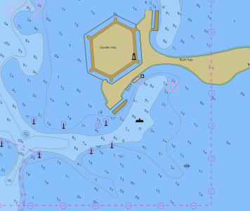
I've attached two images: The first is from the NOAA website. Note the number of soundings shown. I see the same basic presentation on a number of nav apps that use these same charts.
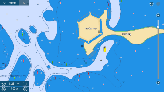
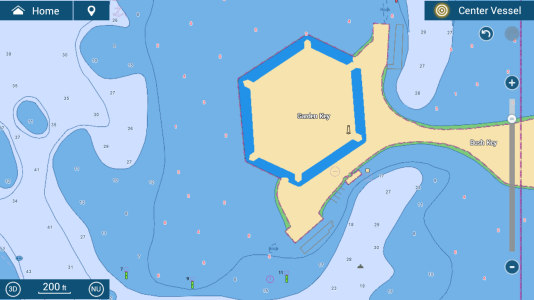
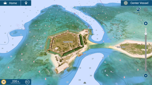
The second image is from my TZT16F with HOs selected. The sounding data is much less dense. Zooming in pretty far does show additional soundings, so the data is present.
I would expect the 1920x1080 display to be capable of showing more data than it is. Is there some combination of settings that will make a difference here?


